Process and Ideation II
- Sketches
- Game Mechanics
- Visual Identity + Branding
- Logo
- Font
- Motion
- Cards + Box
The second part of this process, during my second semester I focused on the creation of the game itself. --
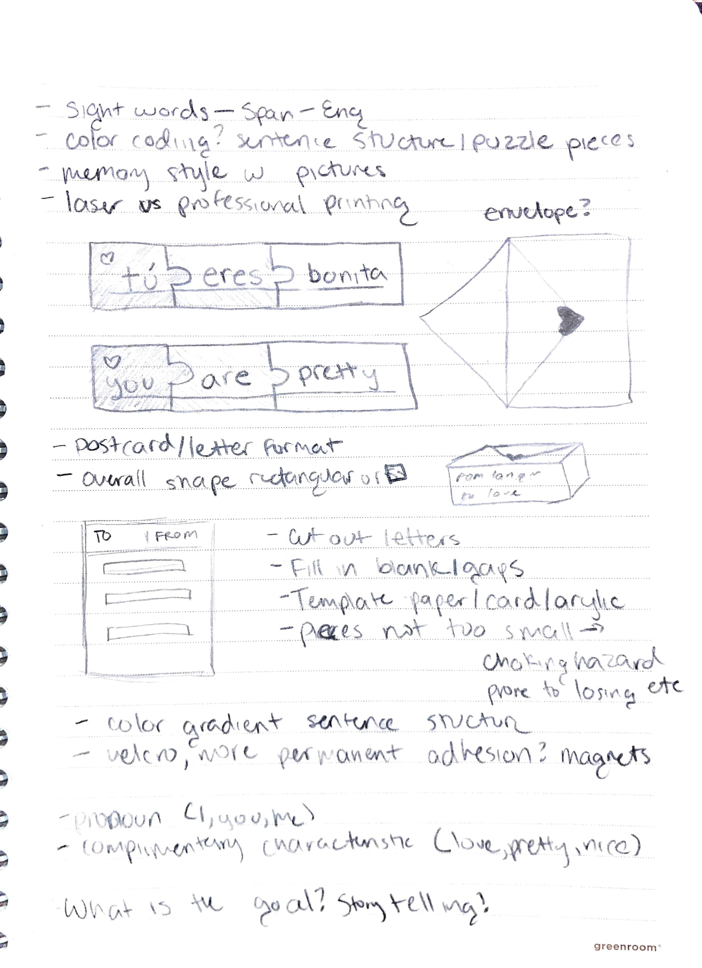
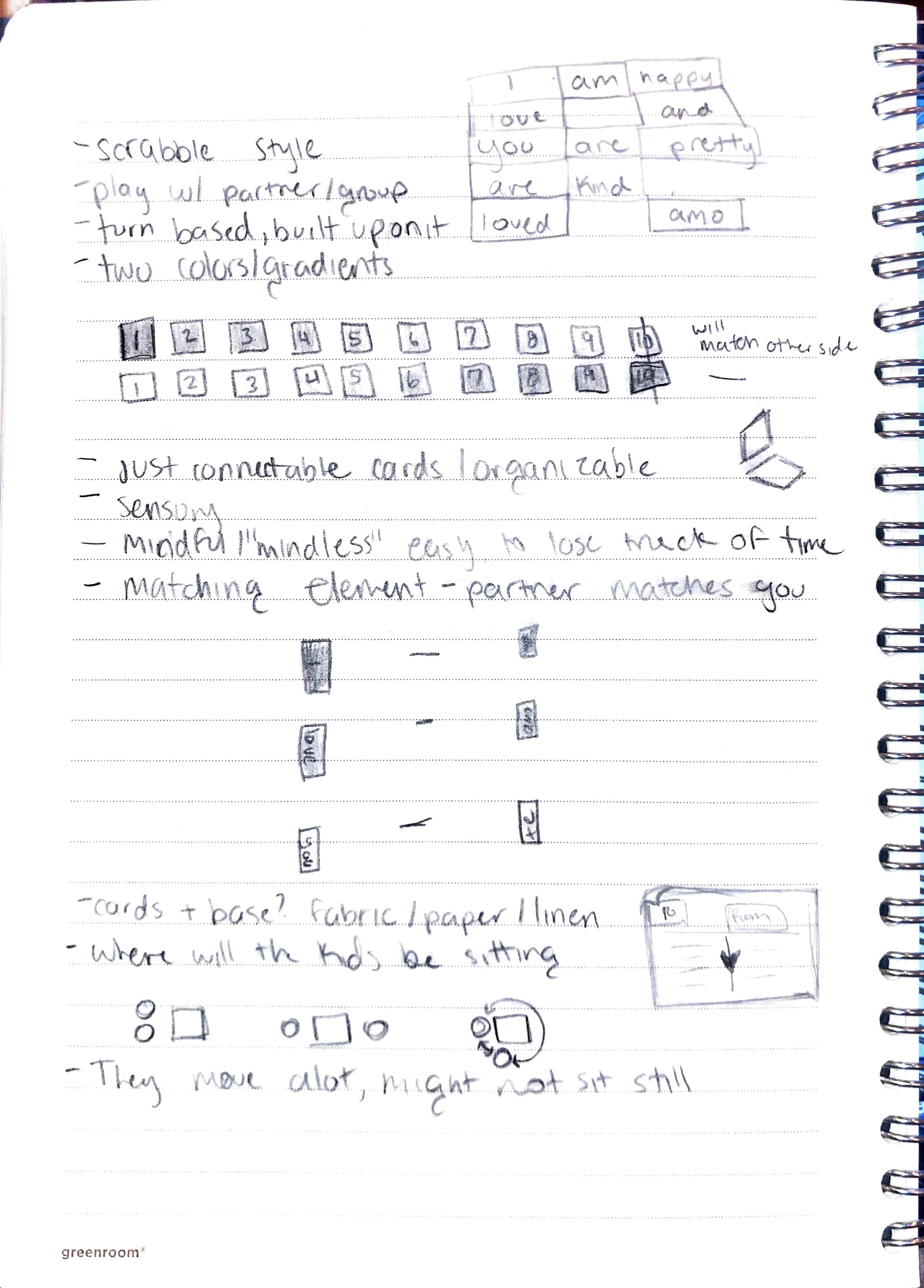
Sketches
Intital sketches of the overall look, mechanics and more.
Game Mechanics
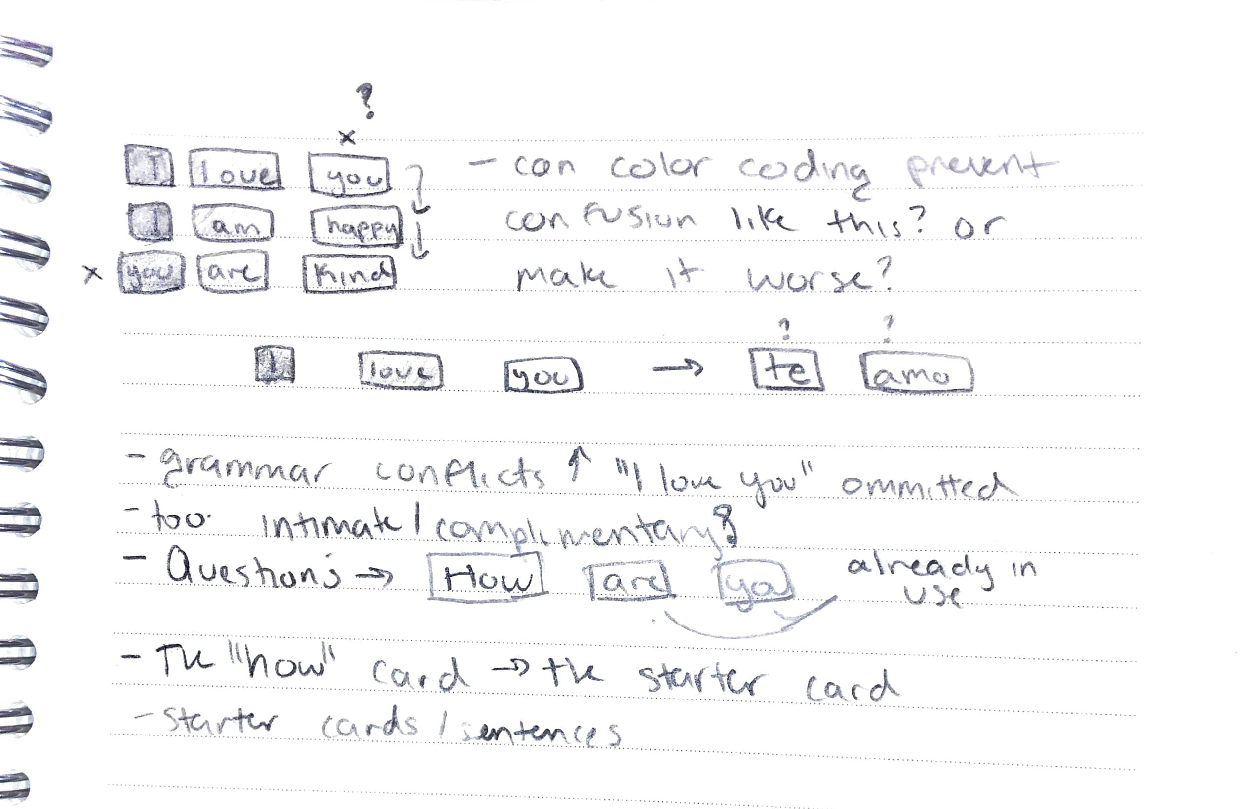
The game itself is quite simple, it is essentially a memory game with English and Spanish. The players can then use the cards to build sentences or "letters" to each other. I wanted to use "sight words" which is some of the first reading kids start doing in school. Some of the examples and charts I found of "sight words" seemed quite advanced but, there is a memorizing element to it which I believe is what the kids may rely on when they first start learning to read.
I also used a gradient color system to help encourage sentence structure. Although whether or not kids abide by it, I don't think is to much of a concern as I do want it to be something kids can just use to have fun with. Game, toy, or language tool.
Visual Identity + Branding
While my time on this project is mostly spent on Spanish, I did envision this as something that would expand to other languages and cultures. Since I don't really belong to those cultures, to work on it myself would require a lot of dedication to understanding them and the lanugages that belong to them. I'd like to work with people directly from those communties as well.
That being said, I wanted this "Spanish" version to be the first one, a template for others. The branding and visuals wouldn't have to be too heavily inspired by my Mexican Culture. And Spanish being the colonial lanugage of Mexico I felt would also present problems, when there are so many indigenous languages.
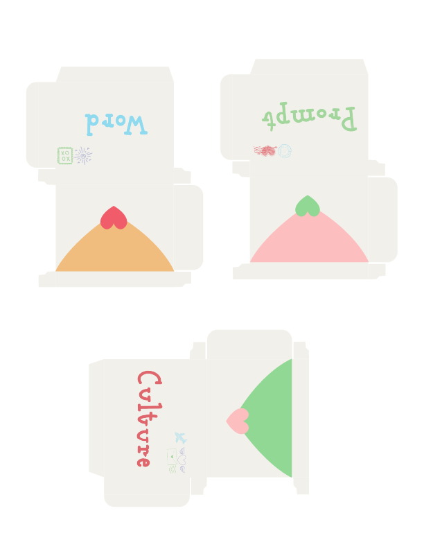
In the envelope/ box containing the cards, because I'd like to keep the cards organized by color, with a large/ flat/ rectangular box to hold them. I don't expect people to keep them organized in that way so I wonder if it's really necessary but that I think I may only be able to do once I have the cards in my hand.
Logo
Font
Motion
Motion design is something I am interested in personally, and I felt could bring the project to life this way too. As a game, this project is not a stationary thing, it's meant to be thrown around and played with by young kids. I wanted to convey those playfull and energetic feelings, and motion seemed like a great way to do that, even if people can't see the physical game in play.
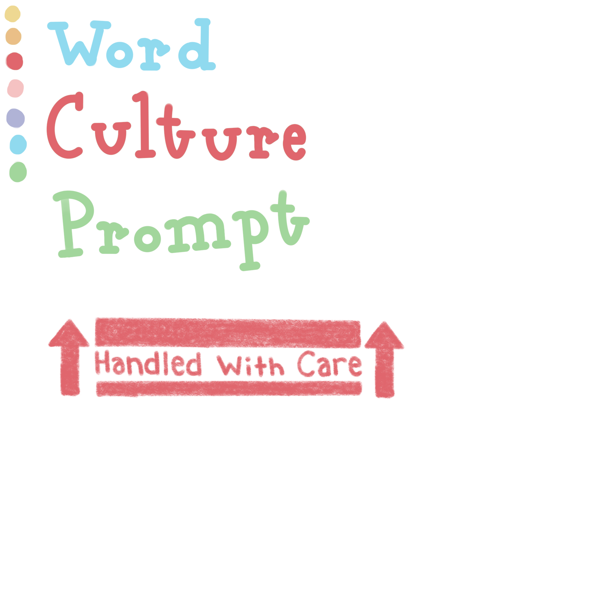
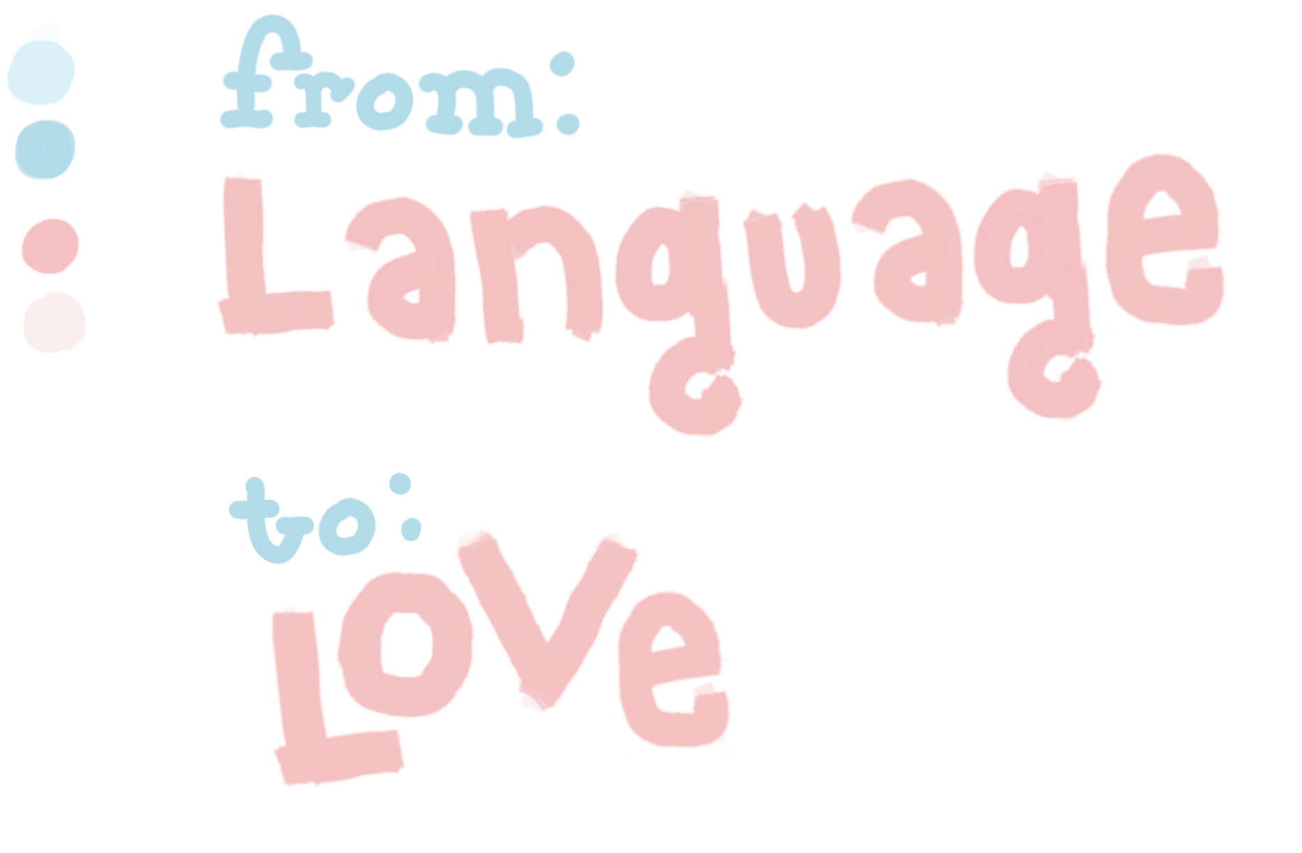
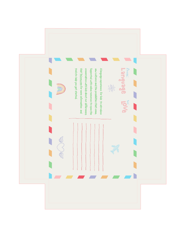
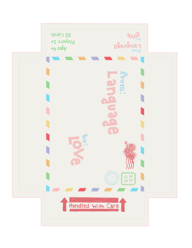
Cards + Box
Fitting the theme of "letters" the design is inspired by postcards and envelopes. Pictures below are the first prototypes I printed out, small and just with regular paper, to fold and see in real life.
extra links
- game site
- personal portfolio